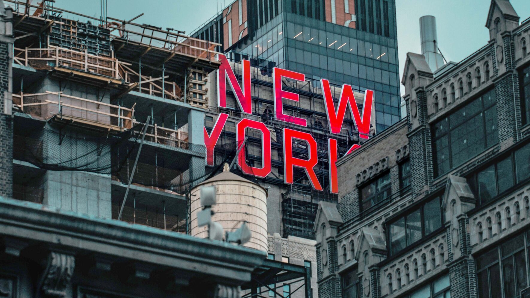
BRANDS OF NEW YORK
A city’s “family of brands” must work together to inform and elevate their place. A city branding portfolio is similar to that of parent companies like SC Johnson. The overarching parent brand has its own identity. But, the company is only successful if Ziploc, Glade, Windex, and the like are connecting with consumers. Let’s use my recent trip to New York as an excuse to look eastward. Here, we’ve pulled together the logos or identity systems of several New York City brands from media, landmarks, transit, parks, cultural institutions, neighborhoods, education, and public safety. See if you can spot things that really jump out:

THE COMMON LANGUAGE OF CITY BRANDING
While all of these logos stand on their own and represent their respective organizations, there are some commonalities. For the most part, they are living in the same context and speaking similar languages.
The government-run agencies (taxis and public schools), for instance, share similar chiseled-yet-bulbous “NYC” city branding lettering. The World Trade Center looks like it may have studied at the New School. The New Yorker could be on display at the Whitney. You could pick up The New York Times at Grand Central and read it on the subway on the way to your favorite park. There are themes like color palettes and typography and appropriation of local landmarks. Of course, you’ve got to watch that last one—it can potentially be a slippery slope.
Underneath the design elements lies a larger common thread: All of these brands play a role in shaping their city. They are synonymous with the New York experience. That’s because they aspire to greatness. Many of these organizations are at the forefront of their respective industries, or are working to get there. Each starts with vision and focus: a clear understanding of where the organization is going and how to get there strategically. Their design language reflects that, and in turn, New York City’s brand is stronger.