Each new year, we partner with leaders who are ready for change. Not the surface-level, spray-Febreeze-on-it kind, but realignment at a foundational level. Reliably we see the same truth play out: when a brand embraces clarity, courage, and a strong creative point of view, momentum follows.

These recent transformations show what can happen when organizations commit to the deep work necessary for lasting change and step confidently into what their brands can be.

Whether you’re preparing for a new chapter or simply curious how modern rebrands come together, we think you’ll find something in this rebrand roundup worth exploring.

EXOS: A Clear Brand Structure That Unlocks Scalable Growth

side-by-side logo comparison


Sondhi Solutions came to us at a pivotal moment: one name, three fundamentally different businesses, and a growing sense that their brand was holding them back. The firm had evolved from its IT-only origins into a trusted business partner for technology, cybersecurity, and talent solutions.

Through conversations with the EXOS team and clients and an in-depth brand audit, we uncovered a unique challenge. Each service area operates independently (most of the time), but also collectively when advantageous. In other words, clients can engage EXOS for one, two, or all three service areas, and multiple brand names could be confusing.

We got to work developing a new name and hierarchy, ensuring the brand would allow for both cohesion and distinction. Today, the EXOS brand family — EXOS Talent, EXOS IT, and EXOS Cyber — collaborates confidently while letting each sub-brand lean into its area of expertise.

EXOS is shorthand for nature’s answer to providing critical support, protection, and growth for many living organisms: exoskeletons. EXOS Companies, formerly Sondhi Solutions, provides that same answer for their clients.

Downtown Indy Alliance: Putting People at the Heart of Downtown

side-by-side logo comparison


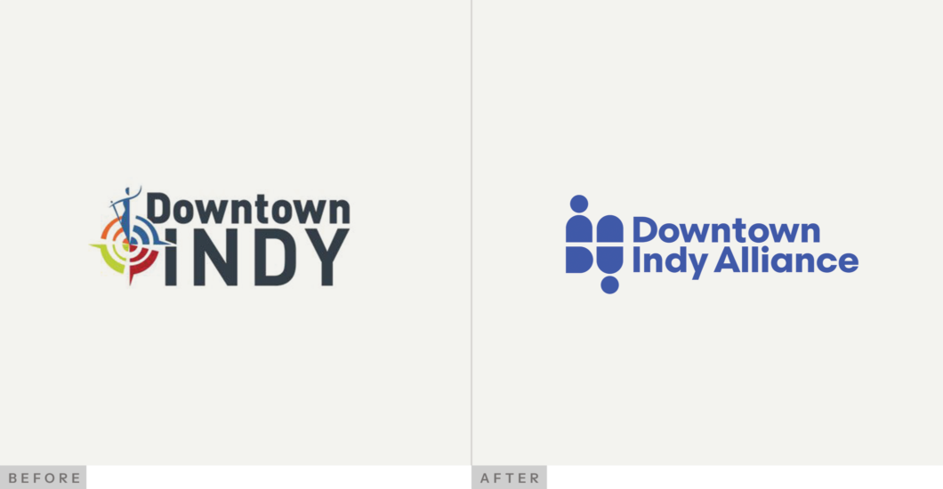
Downtown Indy (the organization) has always played an essential but often invisible role in the life of Downtown Indy (the place). Established in 1993 to serve the square mile around Monument Circle, the organization worked tirelessly behind the scenes to keep the Mile Square clean, safe, active, and welcoming. But as their scope and impact expanded, their brand struggled to keep up.

Their previous name, Downtown Indy, Inc., frequently caused confusion with city government, creating barriers to fundraising, partnership building, and volunteer engagement. As a membership-based nonprofit, they needed a brand that made their role unmistakably clear and their value unmistakably visible.

An evolved name (Downtown Indy Alliance) captures who they truly are: collaborators, caretakers, and connectors whose work fuels the economic and cultural energy of the region. And a refined narrative framework defined their story around the promise that “Downtown Will Move You.” This set the foundation for a people-first identity.

Visually, we built a system inspired by the geometry of the Mile Square. Bold shapes, a vibrant palette, and a flexible INDY mark reflects movement, warmth, and creativity. The new brand communicates both professionalism and joy, honoring the truth at the heart of their work: the people make the place.

Elevate Ventures: Fuel for a Stronger Innovation Ecosystem

side-by-side logo comparison


As an Indiana-based company that works predominantly with other Indiana-based companies, we jumped at the opportunity to work with Elevate Ventures, the state’s most influential force in venture capital. 

Through founder interviews, peer analyses, and deep strategic work, we brought clarity to Elevate’s expanded investment model and the growing suite of services they offer entrepreneurs. We updated their messaging and modernized their identity, so they can step confidently into the next chapter of advancing innovation in Indiana.

The Elevate brand finally matches the scale of their impact with a crisp visual system, a confident voice, and photography that puts real founders at the center.

We also distilled down the idea now central to their platform: fueling founders. 

From strategy and messaging to identity, website, photography, and collateral, Elevate is now equipped with a system that elevates the organization right alongside the innovators and state they support.

Civitas: A Cohesive Identity for a Purpose-driven Practice

side-by-side logo comparison


Denver-based urban design firm Civitas approached us with a challenge that many high-performing organizations face: their expertise and impact were immense, but their brand didn’t fully reflect their stellar reputation. 

We started by immersing ourselves in their world. We observed their projects, attended all-team meetings, and talked with leaders, team members, and ideal clients. From the Commons Park and Belmar projects to conversations with civic leaders across North America, we captured the full scope of what Civitas does, how they work, and why they matter. Industry research, competitor and peer analysis, and a deep brand audit gave us the insights to inform a purposeful rebrand.

The new identity reflects the discipline, balance, and intentionality of Civitas’ work. They now have a flexible toolkit for digital, print, and environmental applications with every element conveying structure, thoughtfulness, and expertise — confidently and consistently.

Crispus Attucks: An Identity That Matches the School’s Legacy


Crispus Attucks High School is an Indianapolis institution with a legacy of resilience, excellence, and pride. Founded in the 1920s to educate the city’s growing Black population, it quickly became known for academic and athletic achievement, often outperforming other schools despite social and financial obstacles. Today, that tradition continues, rooted in health sciences and education, while looking toward the future.

When we approached the Attucks brand, our goal was to honor that legacy while giving the school a visual identity that could carry it forward. Through interviews with students, faculty, staff, and alumni, one word consistently rose to the top: fierce. Tigers (the animals and the students) are formidable, and the school needed a mascot that embodied that strength, pride, and spirit without slipping into generic sports imagery.

We rebuilt the tiger from the ground up, crafting a bold, dynamic mark that captures the energy, resilience, and authenticity of Attucks. Every detail from sharp lines to its strong stance was intentional to create a symbol that works across athletics, academic seals, apparel, and digital platforms. The result is a tiger with real presence: a visual anchor for the school community, one that celebrates history while inspiring future generations.

What These Rebrands Have in Common

This roundup features clients in widely different sectors from civic to education to private enterprise. Yet, they shared a common trait: bold leaders who embraced change, seized the moment, and held tight to their vision of the future. They trusted the process and invested in alignment. In doing so, they moved from “making things work” to building something durable, unique, and compelling.

Your brand should live up to your vision.

Let's begin.

Contact Us