WHAT CAN WE HELP YOU FIND?
University of Notre Dame

Colfax Corner: Where Proximity Creates Progress
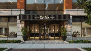
Colfax Corner brings research, industry, and new investment together in downtown South Bend.

The brand narrative and visuals honor the history of the site while generating excitement for what’s ahead.

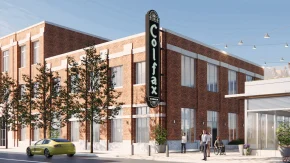
Ancora and the University of Notre Dame came to us with an ambitious vision: transform the historic South Bend Tribune building and surrounding site into a place where ideas and research converge across fields like artificial intelligence, advanced computing, and data analytics. As the first major investment in downtown South Bend’s emerging Tech & Talent District, Colfax Corner needed a brand that reflected the significance of the project and its place within the city.
Services

  • Verbal Identity
  • Visual Identity
  • Brand Application
01

Visual Identity

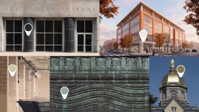
The history of the Tribune building and surrounding block shapes the visual identity, with Art Deco details found throughout the neighborhood providing a visual foundation for the system.

The color palette takes cues from the built environment of downtown South Bend and Notre Dame’s campus while remaining neutral enough to allow tenant and partner brands to stand out when appearing alongside the Colfax Corner brand.

The logo draws inspiration from the former Colfax Theatre sign that once stood mid-block along the south side of the development. That combination of character and history creates a mark that is unique to Colfax Corner.

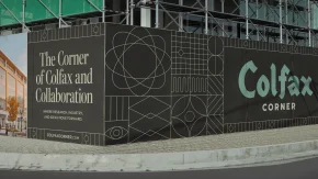
Our supporting graphic elements bring the activity happening inside the building into the visual identity itself. Graphic elements represent scientific disciplines, sparks of inspiration, and the collision of ideas and research. And a strong grid system allows for easy, consistent application.

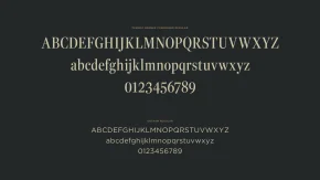
Typography creates another connection between the building’s past and its future. A highly geometric sans serif provides a clean, flexible foundation, while the complementary serif nods to the Tribune building’s newspaper past.

  • Shadow
    #24282a
  • Veridian
    #769d90
  • Gold
    #857550
  • Marl Clay
    #cbc4a7
  • Limestone
    #eae8e3

Typography

The typeface Gotham, designed by Tobias Frere-Jones and Jesse Ragan in 2002, serves as the functional workhorse of the Colfax Corner brand. It’s strong, geometric forms and airy counterspaces echo the Art Deco details of the district and ensure legibility at any size. Gotham is balanced by Fenway Banner, a neoclassical serif face originally designed by Carter & Cone for Sports Illustrated. It’s verticality and structured serifs call to mind the journalistic and publishing legacy of the historic South Bend Tribune building.

02

Verbal Identity

The voice of Colfax Corner is intentional, optimistic, and grounded in place. It builds on the momentum already present in downtown South Bend while connecting that energy to the work and research coming to Colfax Corner.

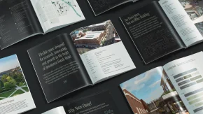
For those audiences, ranging from community members and University partners to prospective tenants and industry leaders, we made an ambitious, complex project easy to understand without diminishing the vision behind it. We crafted a set of brand narratives that became the foundation for copy across the site wrap, website, leasing brochures, and video.

03

Brand Application

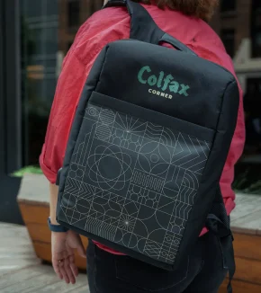
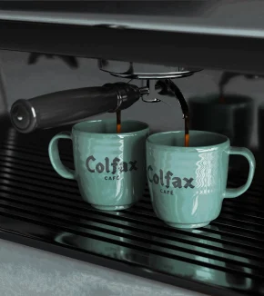
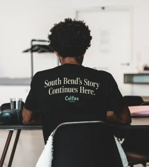
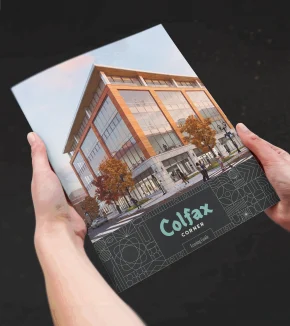
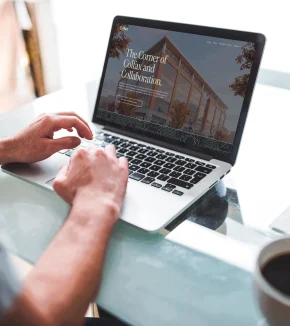
The Colfax Corner brand is designed to work at every stage of the development. A construction site wrap answers the big question ”what’s happening here?” The website and leasing brochures equip the leasing team with the story and specs of the space, while the project video tells the larger story of Colfax Corner and its role in South Bend’s future.

The system also gives the leasing team flexibility to update details as construction progresses and spaces are leased while maintaining a consistent brand across signage, merch, and other brand extensions throughout the development.

04

Impact

Colfax Corner has a brand that belongs wholly to the place it represents. History gives the identity staying power, while its flexible system provides room to evolve as the development comes to life.

Ancora and Notre Dame have a practical set of tools to build interest, attract the right partners and tenants, and generate excitement about what’s taking shape in the Tech & Talent District. As the building fills and the district grows, the brand is built to grow with it.

“From day one, Pivot's team felt like a trusted partner on the project. Their process was thorough and collaborative: thoughtful questions, conversations with everyone who had a stake in the project, and a willingness to push our team to think differently, all while staying responsive to our feedback and direction. We ended up with a brand that felt fresh but grounded in the history of the site, and messaging that captured the spirit, energy, and opportunity of the project — something we hadn't been able to do on our own.”

Katie Wertz
Chief of Staff, Ancora

Capturing the spirit of a special place?

Let’s build a brand with depth.

Get in Touch