Client
Sigma Kappa’s brand stays true to its legacy while looking toward what’s next.

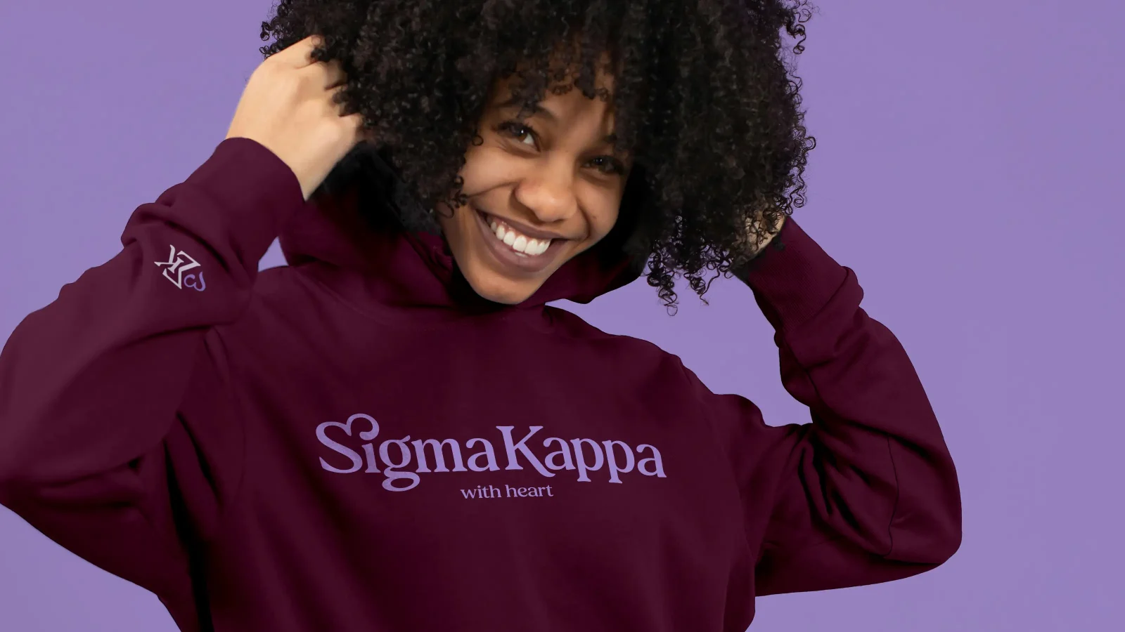
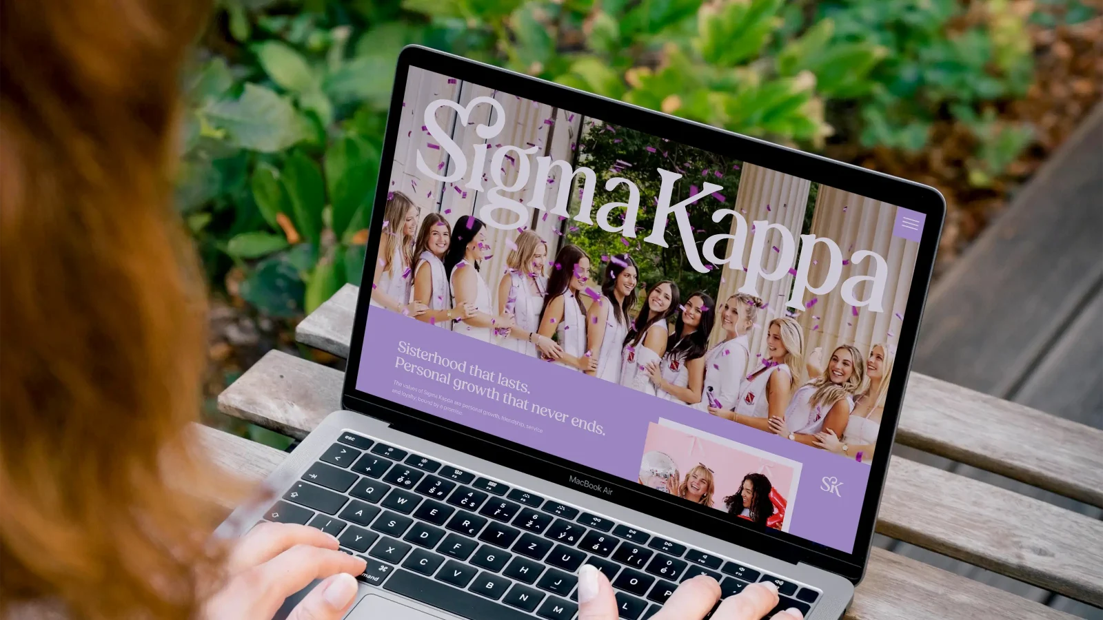
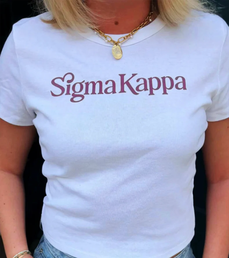
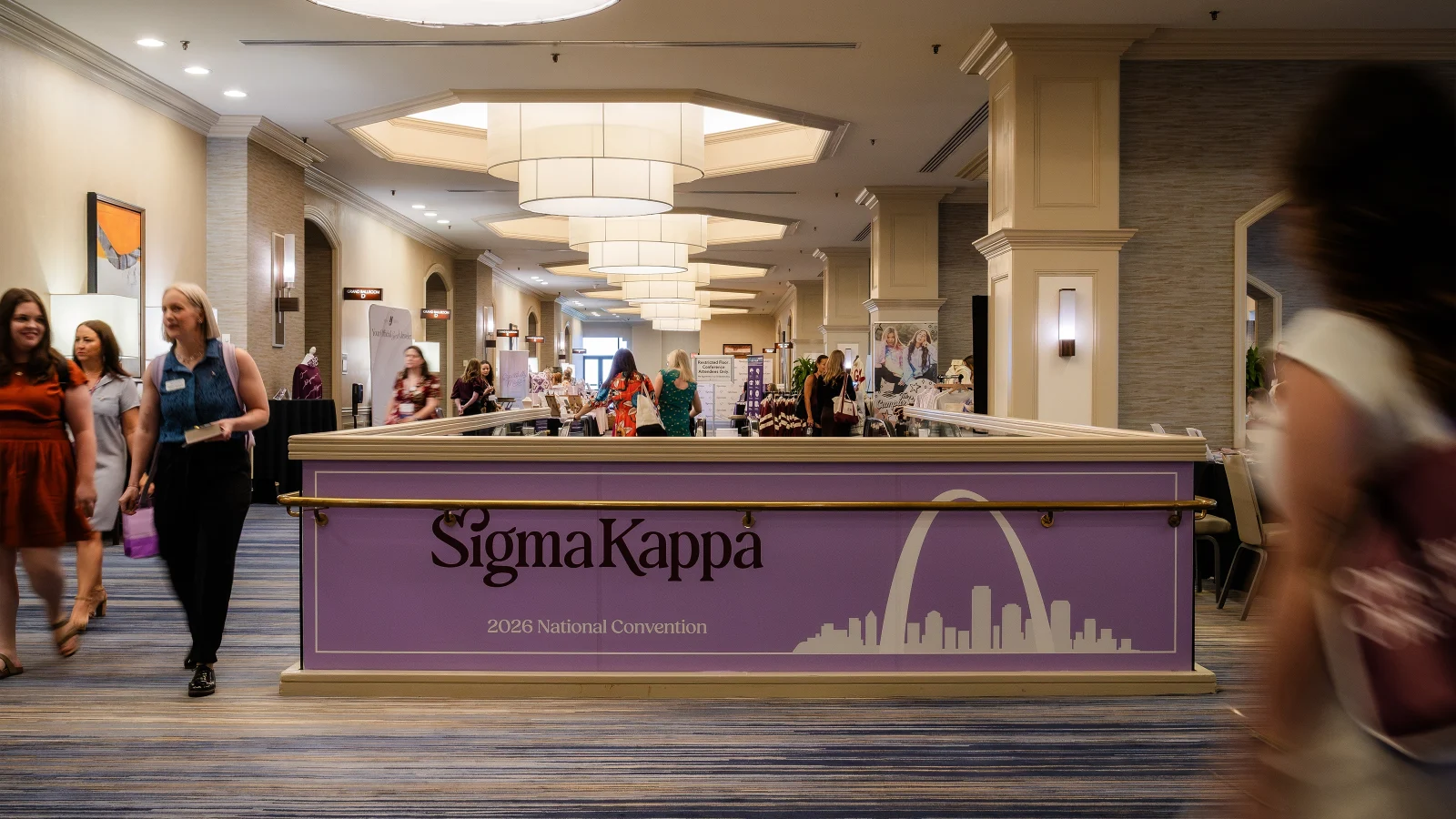
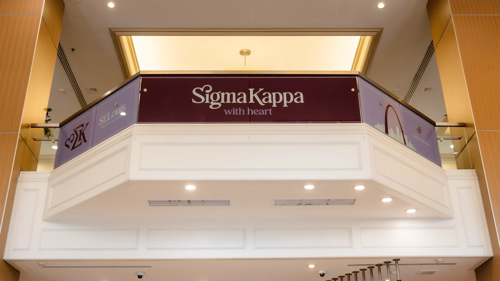
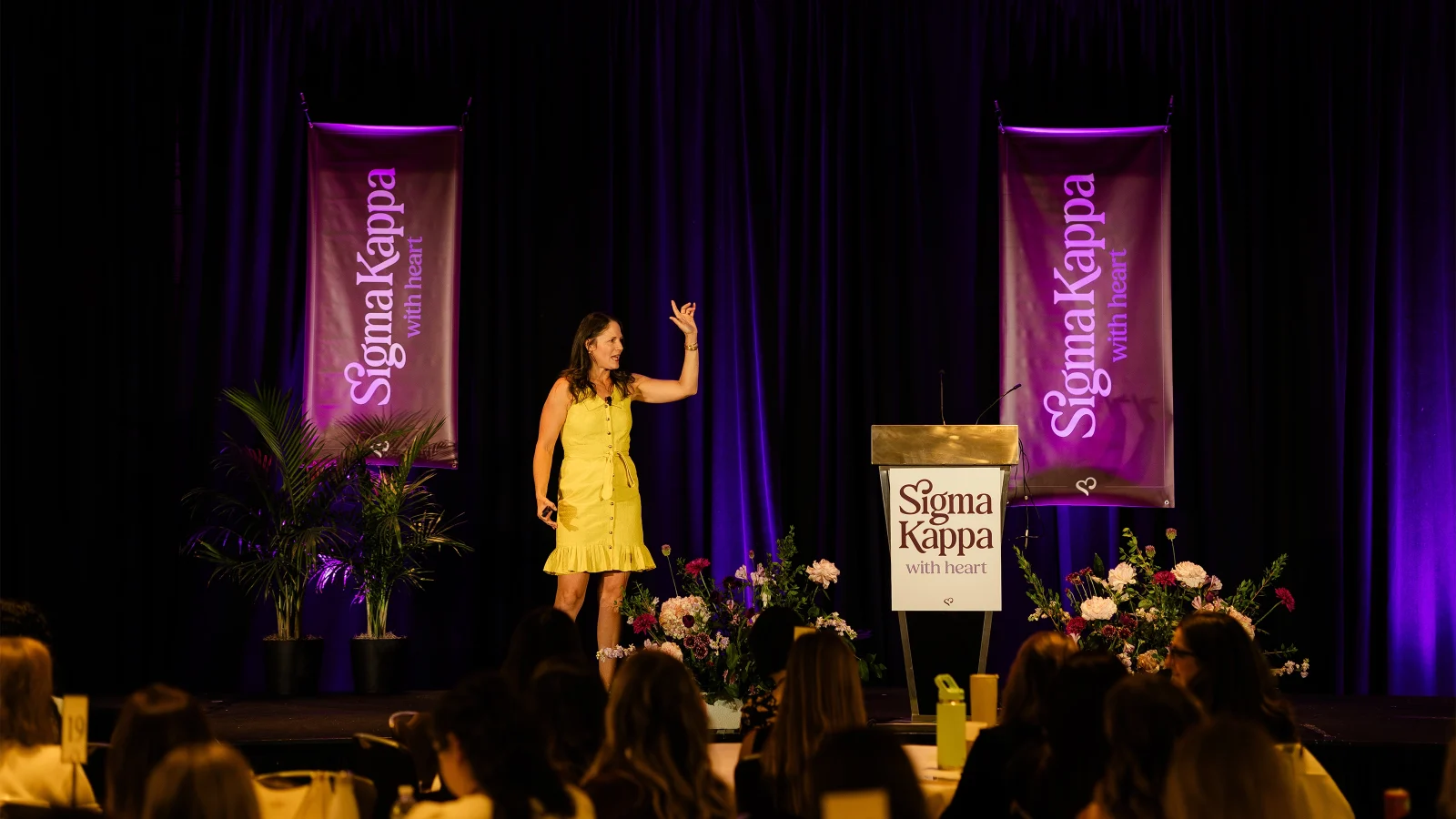
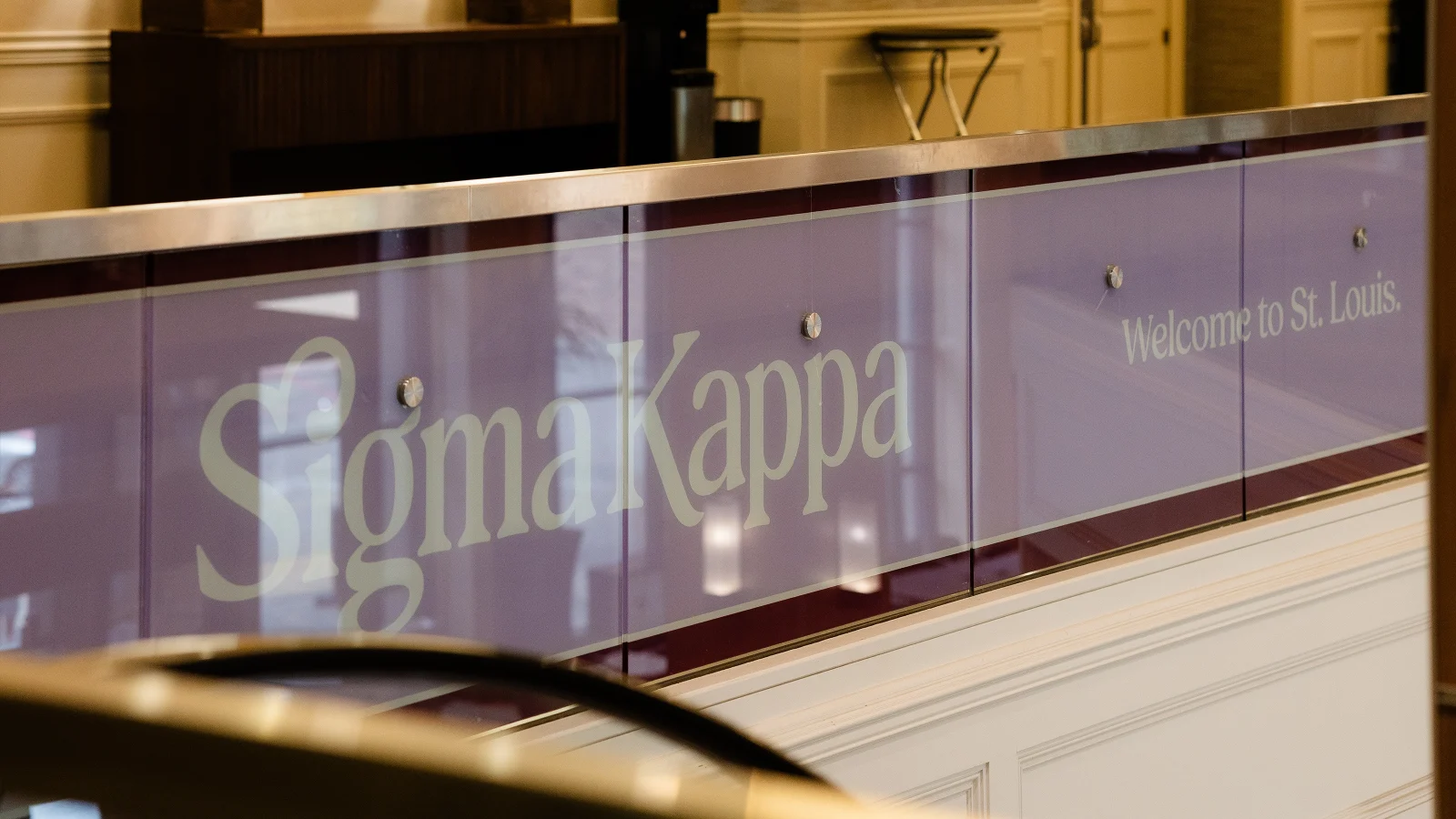
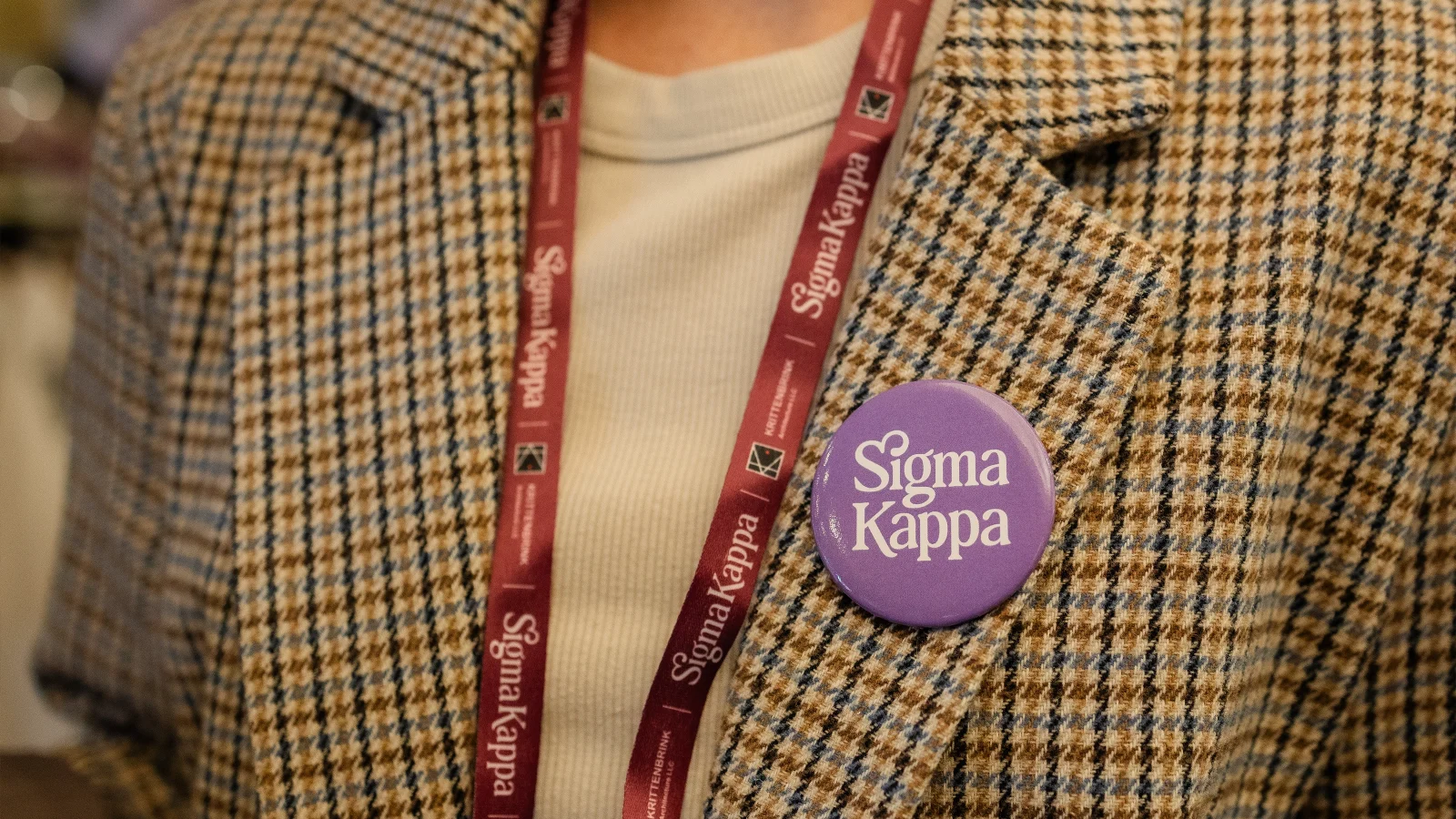
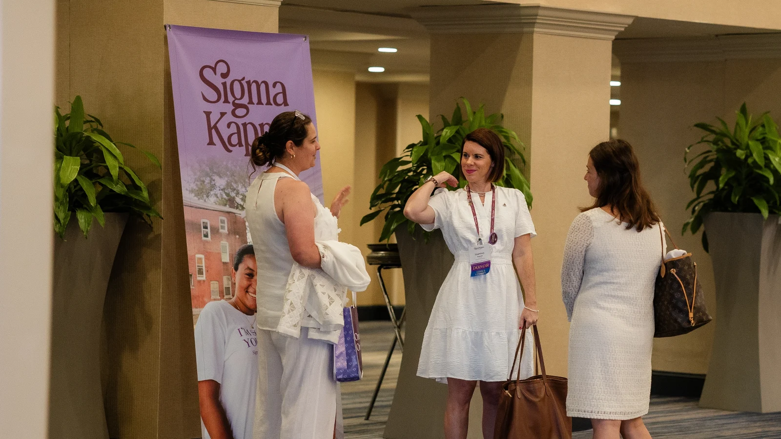
For over 150 years, Sigma Kappa has embodied a legacy of purpose, service, and unwavering sisterhood. When the sorority sought a partner for their brand refresh, they already understood the central challenge: how do you honor that history while uniquely positioning yourself for what’s next? 

Sigma Kappa’s brand had evolved organically over decades, resulting in a fragmented identity that didn’t reflect the organization’s true experience. Their visual identity felt dated to prospective members, while their messaging was inconsistent across entities and communication channels. Most critically, there was a growing tension between honoring the tradition that alumnae valued and projecting the contemporary relevance that new generations expected. Sigma Kappa was at risk of falling behind in a crowded landscape, with a brand that was no longer fully reflecting the experience of its members or the expectations of prospective new members.

Services

RESEARCH
STRATEGY
VISUAL IDENTITY
MESSAGING
BRAND VOICE
TEMPLATES

a woman wearing a sigma kappa hoodie

Brand Strategy

Through comprehensive research, including a brand audit, interviews, and surveys of members ranging from new recruits to tenured alumnae, we uncovered a defining truth: Sigma Kappas are grounded in authenticity—genuine, self-assured, and committed to being themselves. As one member said, “There isn’t just one ‘type’ of Sigma Kappa. We are all different, and that’s what makes us strong.”

In a space often shaped by image and expectation, their commitment to personal growth sets them apart. We found through our research that this differentiator wasn’t just written on the wall or in documents; it is lived out, daily, by the members of Sigma Kappa. 

Their legacy, rooted in their founders being the first women to study at Colby College, further emphasized this message. We wove that story together, including their deep-rooted heart for service, to create a unifying brand platform that guides how Sigma Kappa shows up, connects, and confidently steps into its next chapter.

the sigma kappa website displayed on a laptop

Brand Identity

We created an identity that intentionally sets Sigma Kappa apart, guided by insights from our audit and informed by the brand platform. The wordmark is classic yet custom, introducing warmth through a ligature that forms a subtle heart, bringing the “With Heart” idea directly into the typography.

The heart icon is a flexible, ownable symbol that can stand on its own or function seamlessly within the full wordmark. This duality allows for expression across a wide range of applications while maintaining consistency and recognition. 

As for the color palette, it was important to keep the lavender and maroon, signature Sigma Kappa colors chosen in 1891. We gave them a refresh, brightening the lavender for energy, deepening the maroon for authority, and adding in a balanced neutral which we call ‘Dove Love.’ Any additional colors were left behind, allowing for a simple three-color palette. Purposefully streamlined, the system is designed for clear application, offering versatile pairings that are both distinct and visually engaging.

a t-shirt with the sigma kappa glyph on the chest and the logo on the sleeve

Brand Voice

The refreshed brand voice and messaging architecture come together as a unified system, giving Sigma Kappa an accessible voice designed to connect with every member. Their new voice feels warm, empowering, and authentic, communicating with the confidence of a trusted friend or mentor—someone who believes in you, celebrates your progress, recognizes who you’re becoming, and creates space for growth. This tone is put on display in their expanded open motto:

To create flexibility, we developed a clear voice framework that includes defined do’s and don’ts, along with three distinct communication modes. These modes adapt based on audience, context, and message, enabling Sigma Kappa to show up seamlessly across every touchpoint.

Brand Expression

Built on a simple but intentional foundation, the brand is designed to be easily understood, adopted, and lived out across all applications. We created a robust set of brand guidelines to equip and empower the team to authentically represent Sigma Kappa, whether on the website, merch, business system, or in lifestyle imagery. The refreshed brand reenergizes the Sigma Kappa experience by centering on authenticity, empowering the organization to tell its stories, foster connection, and support members as they serve and grow together.

Impact

The result of our work is a brand that inspires excitement and pride, appealing to new members while honoring the legacy left by all those who have gone before. It’s been received with open arms by alumnae who see their stories reflected in the messaging, and by collegiate members who are eager to embody and style the refreshed brand. And, the intuitive brand system is easy to adopt by those who use it every day, from staff members to chapter representatives. Sigma Kappa now has the foundation to grow into its next 150 years without leaving the last ones behind.

Pivot thoughtfully guided us through a full brand refresh, creating a new visual identity and helping define our voice. Their team took the time to understand who we are, our values, and the vision of our Founders, ensuring the final result felt authentic and enduring. We now have a refreshed brand that clearly differentiates us and positions us for long-term success.

DIANE FREELAND
Senior Director of Communication Strategy

Wondering what makes you stand out?

Let’s start the discovery.

GET IN TOUCH